| http://eserrano.com/logos/img/logos-detail/studio-e-logo.gif |
 |
| http://im1.peldata.com/bl7/61333/33th.png |
 |
| http://www.fuel-creative.co.uk/works/branding/haus-large.jpg |
 |
| http://www.fuelyourcreativity.com/files/2012/50modernlogos/14-50-modern-logos.png |
| http://logofury.com/wp-content/uploads/6698/keylogic_logo6.jpg |
| http://www.logodesignlove.com/images/agency/luckyfish-logo.jpg |
 |
| https://blogger.googleusercontent.com/img/b/R29vZ2xl/AVvXsEiMRUVYshOsdSr26D2L3vWa2uXxM5odpdNt_QAxRPPWgJtx0psYzfmoCbOxWznwRKhHcH-HAnw9xcvykKpjMGeDCWSF5gQJNRS_KH36OTsyfio76LvDhjk8lDKJ28kVTHycfh85dmw6Uw4/s320/modern+logos+1.jpg |
 |
| http://payload208.cargocollective.com/1/13/432862/6474591/Phyxco.Buterbaugh.horizontal-05_880.jpg |
| http://www.thoburnillustrations.com/wp-content/uploads/2010/02/Scot-logo.jpg |
 |
| http://logopond.com/logos/SevenandSix_Logos_LogoPond.gif |
- In the STUDIO e logo, there is unity of design with the use of circular geometrics in mathematical angles to create a symplified yet modern design.
- In the haus logo, the use of sans-serif text in lower case, unifies the design, and the use of the sans-serif letter 'h' in the house shows the progression of design as type gets incorperated to images.
- In the Eric Buterbaugh logo, we see good spatial organisation of design elements, with text and design in alignment. We also see how the design is created out of geometric elements with the use of negetive and positive space to provide unity and we again see the sans-serif text that gives the design a morden touch.
- In the Scot Lienke logo, one sees a unified text and design making it aestheicaly pleasing to the eye, the text also has a good weight.
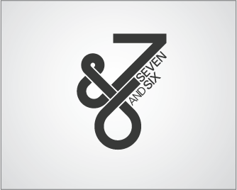
- In the Seven & six logo, there is unity in design with asymmetrical design of elements and bold sans-serif text.
I'm interested in your logos. Please, how can I contact you. Arnaldo
ReplyDelete