Wednesday, 9 April 2014

The United colors of Benetton

http://livinginworld.wordpress.com/brands/united-colors-of-benetton/

http://mondomolly.wordpress.com/2013/01/04/magazine-madness-andor-mania-seventeen-september-1988/

http://www.pinterest.com/pin/7388786859553909/

http://livinginworld.wordpress.com/brands/united-colors-of-benetton/

http://livinginworld.wordpress.com/brands/united-colors-of-benetton/

http://livinginworld.wordpress.com/brands/united-colors-of-benetton/

The United colors of Benetton campaign moves with the era and times, the brand is contraversial and they play on the issue of race creating images of contrast through photography.
The clothes and the style may change through the years but the idea remains the same.


South African Conceptual Design


http://10and5.com/2012/02/28/new-brandhouse-drive-dry-campaign/

http://10and5.com/2012/02/28/new-brandhouse-drive-dry-campaign/

http://10and5.com/2012/02/28/new-brandhouse-drive-dry-campaign/

  • The Drive Dry Campaign is addressing the issue of drinking and driving in South Africa with thought provocking images.
  • The campaign promotes the idea that your actions have deadly Consequences, dealing with differnt scenarios, from death in an accident, being the victim of an accodent and so on.
  • The viewer is being made aware of the dangers of alcahole abuse.
  • Since commercial and conceptual Design have simialar traits as they are in similar fields  and while the other may be purely ideaa based,  its important to possess both as they deal with different genres of design.


The Importance of a manifesto

The Importance of a manifesto


The First things First manifesto 2000 highlights the do's and the don'ts of design through first hand experiances. There are areas that are encouraged and those that are discouraged and some that are left to the readers own discretion. There is also insight on common , helpful methods which can improve the quality of ones work and that is the area i found most interesting.

Other Manifesto's of interest
  • 100+years of design manifestos-http://backspace.com/notes/2009/07/design-manifestos.php
  • 1000 Words: A Manifesto for Sustainability in DesignBy Allan Chochinov- http://www.core77.com/reactor/04.07_chochinov.asp
The Importance of formulating a manifesto

A manifesto can be defined as a public declaration of policy and aims, especially one issued before an election by a political party or candidate. It makes clear the yearnings and ideas of the individual or group and states the issue or subject that they stand for. A manifesto questions society engages them and causes and sets in motion a thought, `the type of thought depends on the manifesto and its ideas. Manifestos creat individuality and enable one to bring up a subject that perhaps.

Thursday, 13 March 2014

My 3 favorite Conemporary Brands

http://www.mercedes-benzlaval.com/sites/default/files/styles/large/public/field/image/article_3.jpg

http://thinkmarketingmagazine.com/wp-content/uploads/2012/08/Mercedes-Benz-logo-evolution-timeline.jpg

http://www.logoinn.net/wp-content/uploads/2011/01/Nike_logo_revolution.jpg

http://www.logoinn.net/wp-content/uploads/2010/03/Nike-Logo.jpg

https://blogger.googleusercontent.com/img/b/R29vZ2xl/AVvXsEhyyc3XjkZ2wGsNJu1_MDhMTnU0Z56LCIlJw43kfSL3m2m4fTJ8_2Z_9mpTBGkKwV80X3fBTJ4GQC1FHXOoYyAzhGIMMkjti2LyOPmTfnD4guwn8wB5UkMa67nI5dSgdJn3ErKhtm8AsDc/s1600/nike.jpg
http://www.wallsave.com/wallpapers/2560x2048/adaidas/314768/adaidas-adidas-brand-originals-sport-shoes-series-get-314768.jpg

http://tokyofashion.com/wp-content/uploads/2008/12/Adidas-Shibuya.jpg

http://wallpapersoo.com/wp-content/uploads/2014/02/january--brand-logos-views-adidas-cool-logo-hd-wallpaper.jpg

  1. These are but three of my favorite brands, they project status and fun, prestige and class. the are established to the point that their symbols have become recognisable even in the most remote areas. These brands have coined simplicity and sophistication.
  2. while improving these brands in any particular way would be difficult, if there was some thing i would touch up or add or an idea that could be worth exploring would be to merge the logo with the name plaing with use of positive and negetive space, creating an even more aestheically pleasing image or brand.
  3. This would not only unify the symbol and the name but create a statement.


Sunday, 2 March 2014

A look away magazine(content and style)

"A look away" is an arts and culture magazine, with fresh outlook and original concept. The magazines goal is  to celebrate the arts and make them accessible to a wider audience in a non-arrogant way. 
The magazine caters to young fresh market, which is basically the youth of the country to adults who are interested in the arts. The cover of the magazine is always artistic, with the Name of the magazine always incorperated in to the design.
Their coves are always unique as they cover a range of art forms. Their cover layout is free flowing and does not follow any grid layout, there is no spacial organisation or placement and the elements seem to place themselves inthe artwork.
The magazine stays true to the theme of a arts and culture magazine as their content covers impressive illustrations, fine art aswell as passages by emerging young bold writers.

Source: http://www.vansa.co.za/about/copy_of_news/a-look-away-announcement


http://www.vansa.co.za/about/copy_of_news/a-look-away-announcement


Friday, 14 February 2014

Contemporary Logos

http://eserrano.com/logos/img/logos-detail/studio-e-logo.gif
http://im1.peldata.com/bl7/61333/33th.png

http://www.fuel-creative.co.uk/works/branding/haus-large.jpg

http://www.fuelyourcreativity.com/files/2012/50modernlogos/14-50-modern-logos.png

http://logofury.com/wp-content/uploads/6698/keylogic_logo6.jpg

http://www.logodesignlove.com/images/agency/luckyfish-logo.jpg

https://blogger.googleusercontent.com/img/b/R29vZ2xl/AVvXsEiMRUVYshOsdSr26D2L3vWa2uXxM5odpdNt_QAxRPPWgJtx0psYzfmoCbOxWznwRKhHcH-HAnw9xcvykKpjMGeDCWSF5gQJNRS_KH36OTsyfio76LvDhjk8lDKJ28kVTHycfh85dmw6Uw4/s320/modern+logos+1.jpg

http://payload208.cargocollective.com/1/13/432862/6474591/Phyxco.Buterbaugh.horizontal-05_880.jpg

http://www.thoburnillustrations.com/wp-content/uploads/2010/02/Scot-logo.jpg

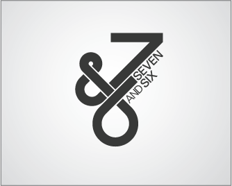
http://logopond.com/logos/SevenandSix_Logos_LogoPond.gif
Favorite 5 logos: 1. Studio e, 2. hause, 3. Eric Buterbaugh, 4. Scot Lienke, 5. Seven & six
  1. In the STUDIO e logo, there is unity  of design with the use of circular geometrics in mathematical angles to create a symplified yet modern design.
  2. In the haus logo, the use of sans-serif text in lower case, unifies the design, and the use of the sans-serif letter 'h' in the house shows the progression of design as type gets incorperated to images.
  3. In the Eric Buterbaugh logo, we see good spatial organisation of design elements, with text and design in alignment. We also see how the design is created out of geometric elements with the use of negetive and positive space to provide unity and we again see the  sans-serif text that gives  the design a morden touch.
  4. In the  Scot Lienke logo, one sees a unified text and design making it aestheicaly pleasing to the eye, the text also has a good weight.
  5. In the Seven & six logo,  there is unity in design with asymmetrical design of elements and bold sans-serif text.